Context & Stakes
Where we started
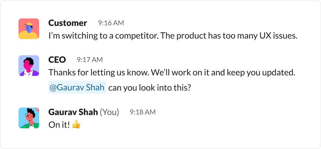
I joined Hamming AI as the first product hire. The product had been built for a year without a designer, which left us with heavy UX debt: inconsistent UI, messy workflows, and no design system to hold it together. Customers were starting to churn. The breaking point came when one told our CEO they were leaving for a competitor because of "too many UX issues."
The market we were in
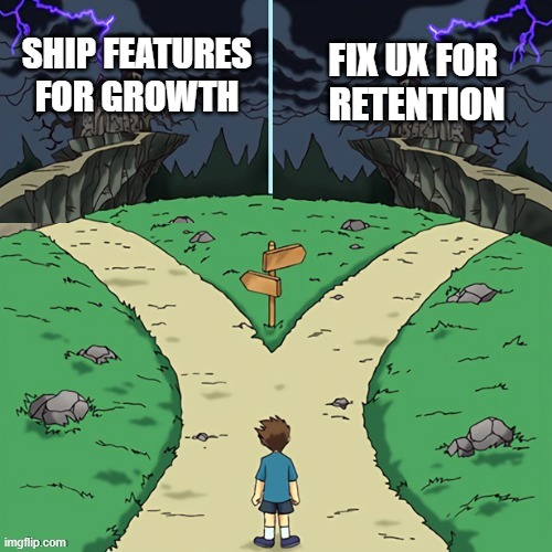
AI was moving fast. Competitors had already cloned our product and were racing to add features. In that environment, shipping new functionality was critical. Growth was the metric that mattered for raising the next round. But churn was just as dangerous. In early-stage startups, your best sales channel is word of mouth. If existing customers left unhappy, we weren't just losing revenue, we were losing our loudest advocates.
The stakes with enterprise
At the same time, we were negotiating with Cisco. Enterprise buyers don't sign deals because of great UX. But they can walk away if the product feels confusing or unpolished. Testing AI voice agents is already complex. If we made it harder than it needed to be, we risked being dismissed. With competitors priced similarly, usability could tip the scales. Churn threatened our base. Usability threatened our biggest deal.
The paradox
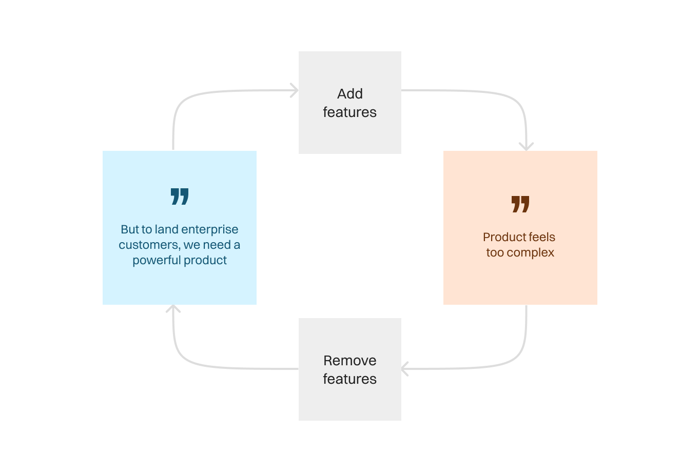
This put us in a bind. To land Cisco, the product had to become more powerful. To keep current users, it had to feel simpler. More capability usually means more complexity. Our challenge was to deliver both at once, without breaking the product or the team.
Constraints on execution
The design team was two people, including me. Engineering was stretched thin across backend work, bug fixes, and a new marketing site. There was no official deadline, but everyone felt the clock ticking. Founder-led sales meant product tradeoffs had direct revenue impact. Nobody debated whether UX debt existed. The question was how much to fix now versus how much to ship. My role was to make the tradeoffs clear and set a path forward that didn't sacrifice growth or retention.
Why this mattered now
Doing nothing wasn't an option. Ignore UX and we lose trust, slow deals, and fuel churn. Ignore velocity and we fall behind competitors shipping faster. The stakes were high on both sides. The only path forward was a strategy that balanced speed with simplification.
Framing the Challenge
Different lenses, different truths
Designers saw inconsistent UI. Engineers pointed to tech debt and slow load times. Leadership worried about churn and growth. Every perspective was valid, but nobody had a full 360° view of the product. Even as someone inside the company, I found myself struggling to connect features into a coherent mental model. If I felt lost after months of immersion, what chance did a new customer have?
Shifting priorities
Before this churn moment, our energy was focused on building new features. The churn message forced us to stop and ask: are we building on a shaky foundation? It wasn't clear what "fixing UX" even meant, but it was clear we needed data before making tradeoffs. Churn became the top priority, and feature velocity slipped into a close second.
The call for research
That ambiguity was the challenge. We could guess at problems forever, but without clarity we risked fixing the wrong things. What does "UX issues" actually mean to customers? Where in the workflows do they get stuck? What feels unnecessarily complex? We decided the only way forward was to talk to users directly. This wasn't just about identifying issues. It was also a way to show customers that we cared, and to keep them engaged while we improved.
How We Approached It
My co-designer and I built a lightweight research protocol. We chose an unstructured format because we wanted to hear people's biggest problems in their own words, not funnel them into ours. Everyone we spoke to worked in tech and had strong opinions, so we knew they would fill the space. But we still carried a guide to fall back on if a conversation needed direction. Our method was simple: a screenshare, show-and-tell walkthrough of their workflow, starting from before they even opened our platform.
We began each session by making participants feel comfortable. We told them we were here to listen, not to judge, and that we would handle the prioritization on our end. Then we asked them to walk us through their process: what are their goals, their context, and their motivations? Who else in their org uses the tool, and how? Where do they get stuck? At the end, we'd share early patterns from other interviews and invite them to react or add new context.
The product flow in theory
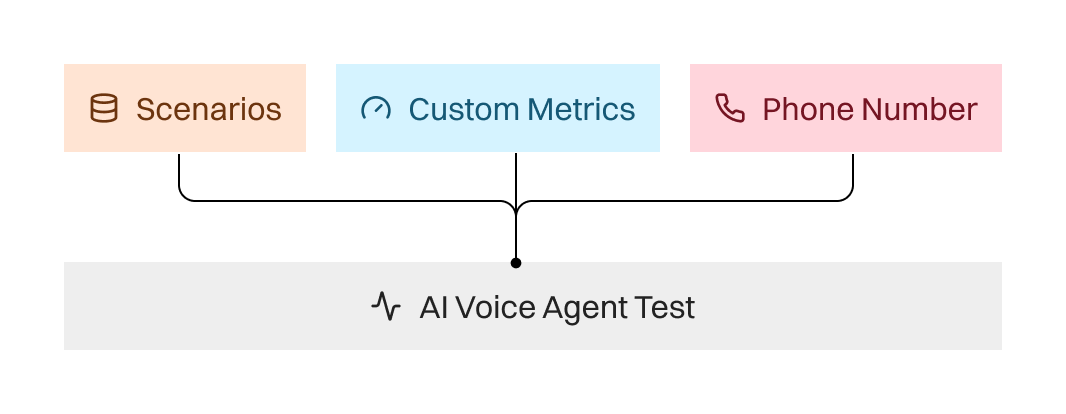
To understand why users struggled, it helps to explain the basics of how Hamming worked at the time. Testing an AI voice agent required three separate pieces:
- Scenario Collections: sets of test cases.
- Custom Metrics: alongside standard metrics like latency, users could define their own. For example, a "frustration checker" powered by an LLM would rate call transcripts on a custom scale.
- Phone Numbers: inbound tests required users to provide a number; outbound tests required calling a number we provided.
In theory, once you combined the three, you could run a test. In practice, these inputs lived on different tabs. Running a test happened through a button on the Scenarios tab. The setup was scattered and the logic was opaque.
What we observed in practice
Users regularly got lost connecting the dots. They struggled to understand how Scenario Collections, Custom Metrics, and Phone Numbers fit together. Incompatible metrics were hidden in the UI, leaving users confused about why they couldn't find what they needed. They often didn't know what to change to make a test run.
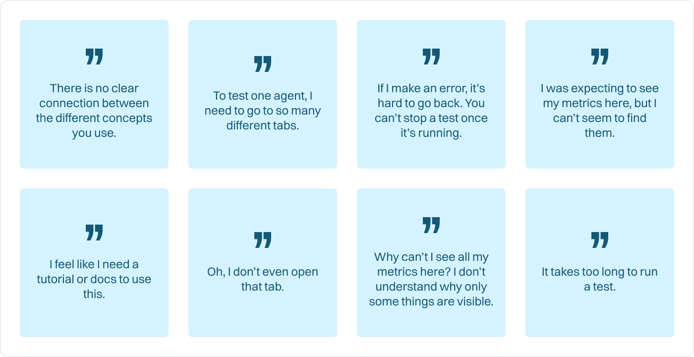
Interviews revealed something deeper: this wasn't just about clunky navigation. It was a mismatch in mental models. Users didn't think in terms of scenarios, metrics, and phone numbers as independent objects. They thought in terms of voice agents. For them, a voice agent was the central thread, and everything else belonged to it. That framing was missing entirely from the product.
The consequences
The result was unnecessary training, patchwork workarounds, and a steep learning curve for every new team member. Customers hacked together their own methods to extract value from what was, on paper, a technically powerful tool. Our core value prop, AI agent testing, was strong. But if customers couldn't unlock that value without friction, the business was at risk. The research validated what we had suspected: the product wasn't just messy. It was actively pushing people away.

Workshops: Making the Product Understandable
The complexity problem
A theme that came up again and again in interviews was that everything felt too complicated. Something as simple as running a test often took ten steps spread across three different pages. Step 1–3 lived on page one, 4–6 on page six, and 7–10 on page four. Users didn't just find the process long; they found it disorienting.
To fix this, we needed more than just design tweaks. We needed engineering and product context. What did it actually take to run a test? How did these objects connect to each other? Which attributes were essential, and which were noise? That understanding was the foundation for eliminating clutter and building a mental model that matched how our users thought.
Object mapping workshop
We gathered the team for a workshop to map out the product's core objects. The goal was to get everyone (design and engineering) on the same page about what exists in the system and how it should behave.
We worked through a series of questions together:
- Who are our different user types, and what are their roles?
- What goals does each user have when testing?
- What are the necessary objects to achieve those goals?
- What attributes does each object need?
- How should users engage with each object?
- Where should these objects live in the product?
One example: Product Managers cared about tracking quality over time, monitoring KPIs, and quickly spotting when something broke. Their needs were very different from developers, who cared about debugging specific test cases. Mapping these differences gave us clarity about what objects needed to exist and what each user expected from them.
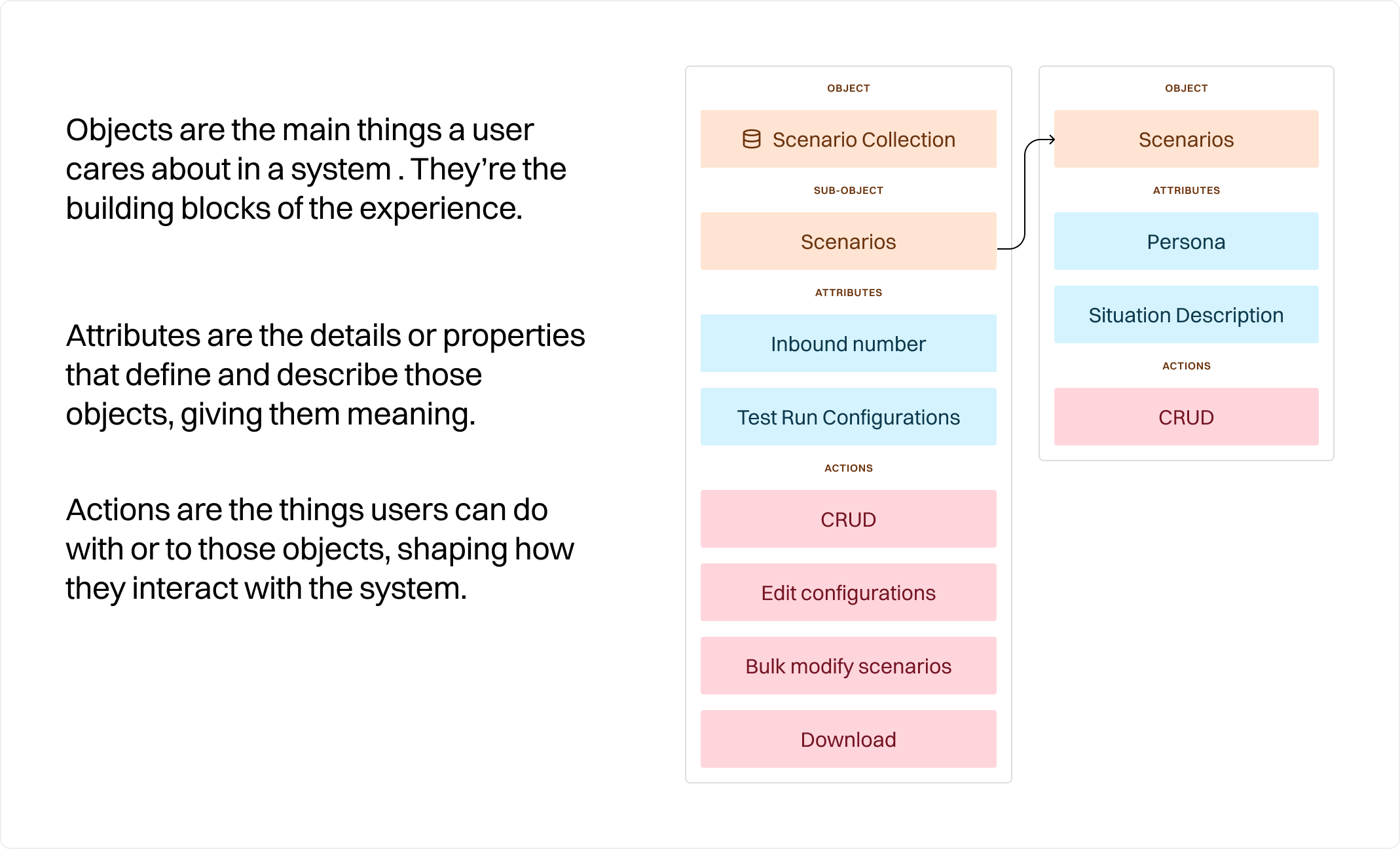
Each block here is a single object with its attributes and actions. The team mapped over 20 of these to align design and engineering on a shared model.
Understanding our users deeply
Something that was absolutely critical for us was understanding our users deeply. With an enterprise product, there's so much more nuance that needs to be understood. Who is the buyer? Who is the user? How can the user successfully advocate for your product at their company? Here is an example of the depth to which we understood one of our user groups.
For product managers, the platform needed to answer one core question: is something broken, and what's the business impact?
PMs live and die by KPIs like success rates, latency, and overall response quality. Their performance is often tied directly to these metrics, promotions, credibility, and even job security can hinge on them. They don't want raw data; they want clear, visual insights they can act on quickly.
When something goes wrong, they need to know why. Which flow failed? Where did users drop off? How is quality trending over time? These insights allow them to prioritize the roadmap, justify tradeoffs, and show impact across the company.
Sharing context is also critical. PMs are the connective tissue between leadership and engineers, so they need lightweight ways to package insights into screenshots, reports, or links. They're comfortable in tools like Figma, Linear, and Notion, and expect the same ease of collaboration here.
In short: PMs work in impact mode. They need to see when things break, understand the root cause, and translate those insights into business outcomes and roadmap decisions.
Key takeaways from object mapping
- The Customer Voice Agent was the central object missing in our model. Everything (scenarios, metrics, phone numbers) should connect back to it.
- Different archetypes had very different needs, so flexibility was essential.
- We could finally see how pieces connected across the system instead of treating them as silos.
This led us to a clearer organizational model:
- Global level (all agents)
- Agent level (a specific voice agent)
- Node level (parts of a conversational flow)
- Individual call level (test runs)
This layering aligned with how customers actually thought, matched industry shifts toward conversational pathways, and set us up to scale in the future.
Customer journey workshop
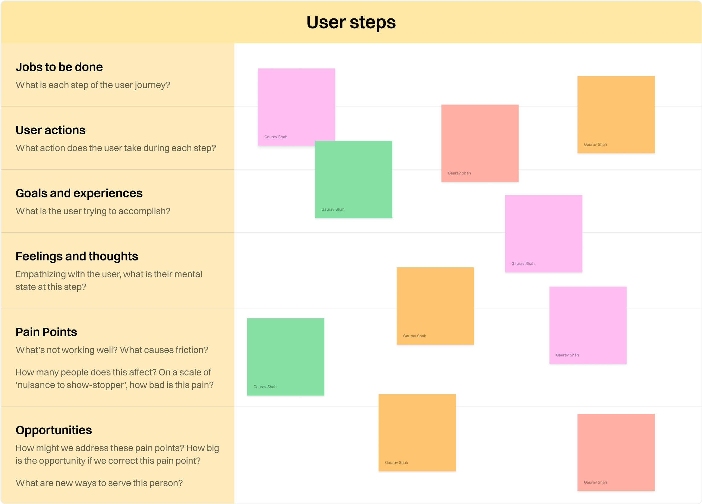
Of course, reorganizing information wasn't enough. We also needed to simplify the process. So we ran a second workshop to map the current and future workflows.
We broke it down step by step:
- Current jobs-to-be-done and user actions
- Their goals, thoughts, and pain points at each step
- Opportunities to automate, set defaults, or cut steps entirely
- A future-state process diagram that reflected what we wanted users to experience
From this, we prioritized three focus areas. The biggest insight was that we could (and should) do far more to hand-hold users through pre-deployment testing. The workshops also helped us turn customer insights into actionable items instead of just a laundry list of complaints.
Shared vision
With this foundation, we drafted mocks that showed how the product might look if split across multiple "zoom levels." This gave the team a concrete vision of the future product. For the first time, we weren't just fixing surface-level problems, we were aligning on how the system should work at its core.
Strategic Trade-offs & Design Strategy
A moment for big change
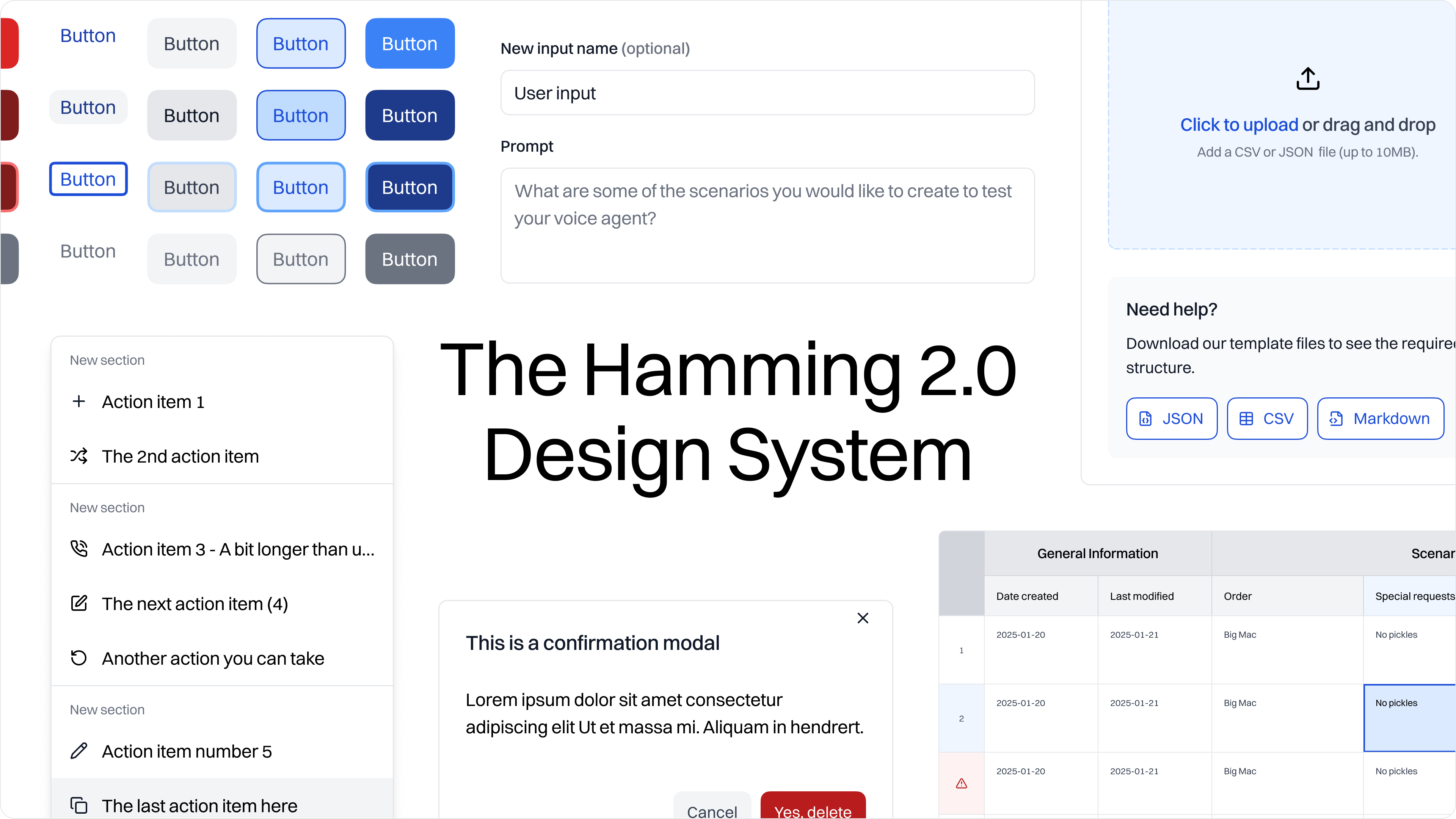
The scope of what we were tackling felt like a Hamming 2.0. We weren't just reorganizing flows. We were rethinking the product's foundation and how it presented itself. The redesign gave us an opening to update our design language and system. This mattered not only for usability, but for how we looked to customers like Cisco. A more polished, cohesive product would help us land enterprise trust.
Why a design system mattered now
We had been pushing for a design system for months. With only two designers, consistency was a constant challenge. Standardizing our work would make us faster and reduce errors. On the surface, the new system didn't radically change how the product looked. Typography and colors were the most visible shifts. But the underlying consistency meant we could design, test, and ship at a higher quality bar. Eventually, we hoped to evolve it into Storybook components so the frontend could fully reflect the new language.
This was the right moment to roll it out because:
- We needed polish for enterprise prospects like Cisco.
- We were already redesigning core information architecture and processes, so using the new system in Figma aligned design and engineering.
- The team was energized. Seeing a refreshed product boosted morale and gave everyone a sense of progress.
Building on top of Flowbite
We built the system on top of Flowbite, which was already part of our codebase. That gave us two advantages:
- It was fast. Flowbite components were familiar to engineering and easy to extend.
- It was practical. We were already mixing Flowbite with Shadcn and custom components, so it fit naturally.
From there, we created what the product actually needed. Tables were core to our workflows, so we built robust table and cell components. We refined dropdowns, notifications, and charts to match real-world usage. Smaller pieces (atoms) combined into larger, reusable molecules. The system gave us speed, consistency, and a shared foundation.
Quality over novelty
This wasn't about inventing new features. It was about polishing the bets we had already made. We knew customers were using these capabilities. The problem was how they were organized, presented, and connected. A design system gave us the leverage to deliver quality faster and the credibility we needed with both current customers and future ones.
Execution Highlights
Mini Case Study: NavBar Redesign
Our redesign began with something small: the navigation bar. Even this simple change carried very specific UX and business goals.
The old navigation took up too much space without giving much back. It had a separate top bar just to hold account details. As the product grew, new tabs piled on until users with smaller screens actually had to scroll just to see all their options. That kind of friction wasn't sustainable, especially as we kept adding features.
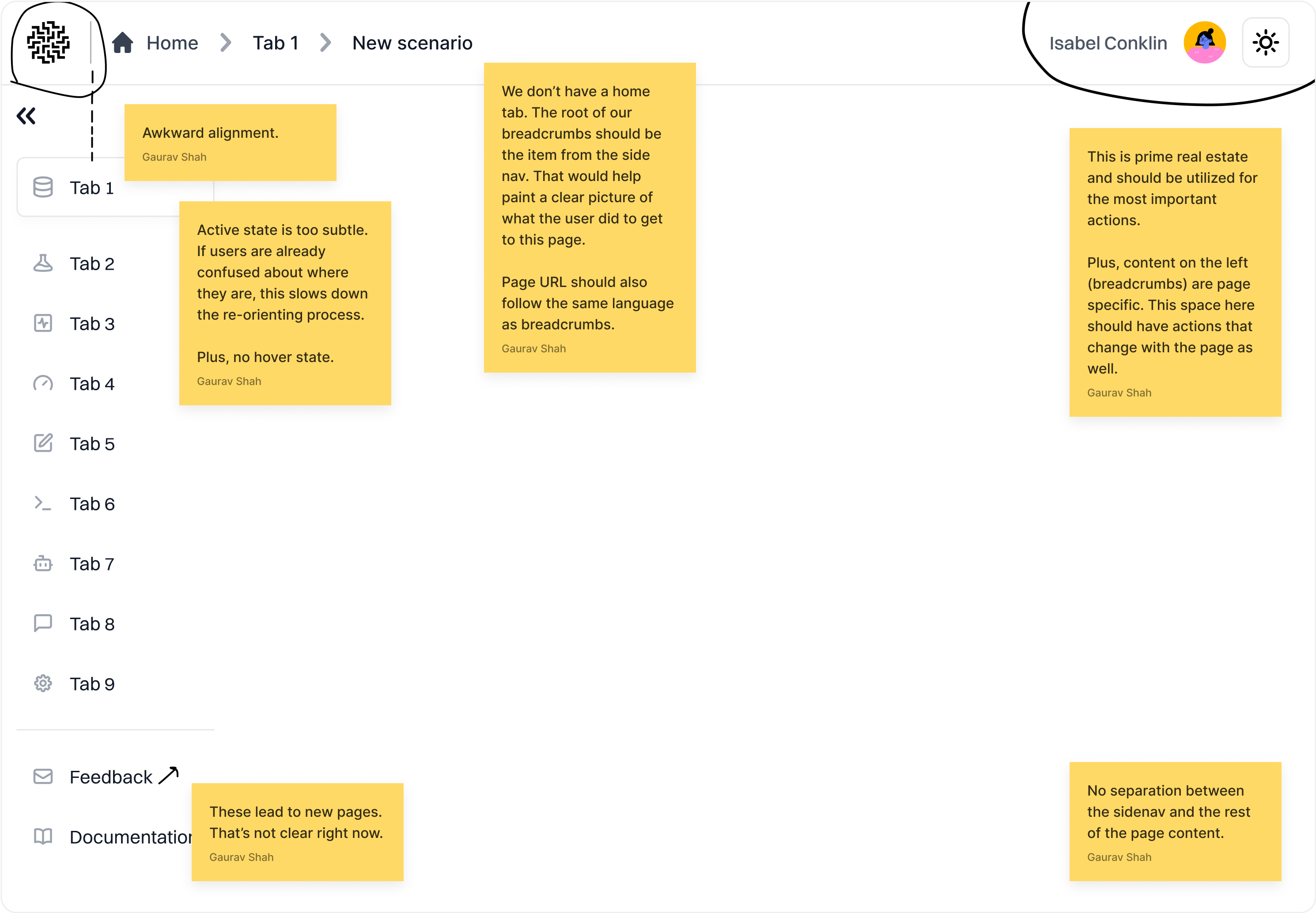
The new design addressed these issues directly:
- Condensed layout: created room to add new features without clutter.
- Smarter active states: used color strategically instead of heavy drop shadows, making it easier to scan with less visual noise.
- Integrated account settings: placed at the bottom of the nav, eliminating the top bar entirely and freeing up space for core actions.
- Repurposed top bar: now used for page titles, breadcrumbs, and page-specific actions, helping users stay oriented while working across multiple tables and data views.
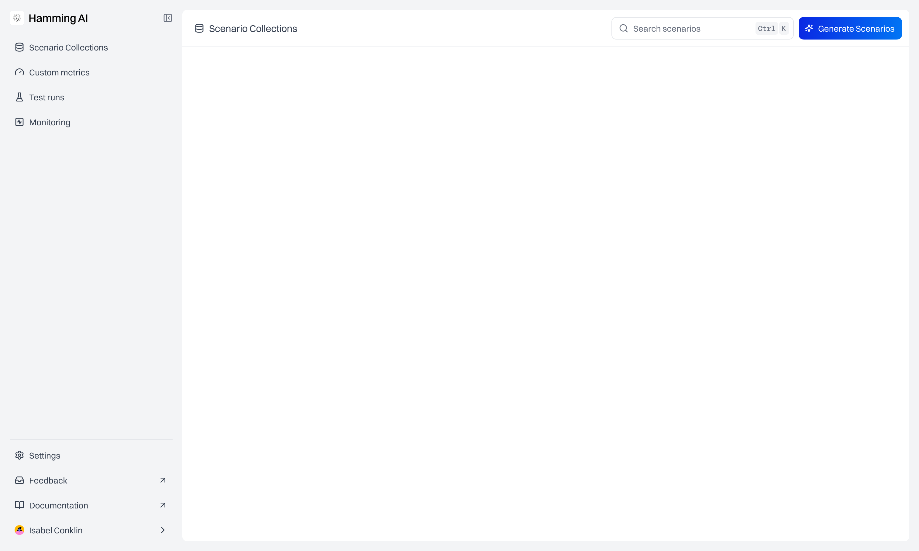
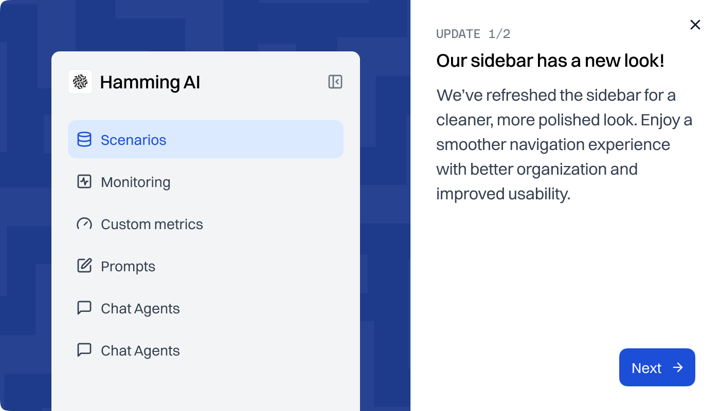
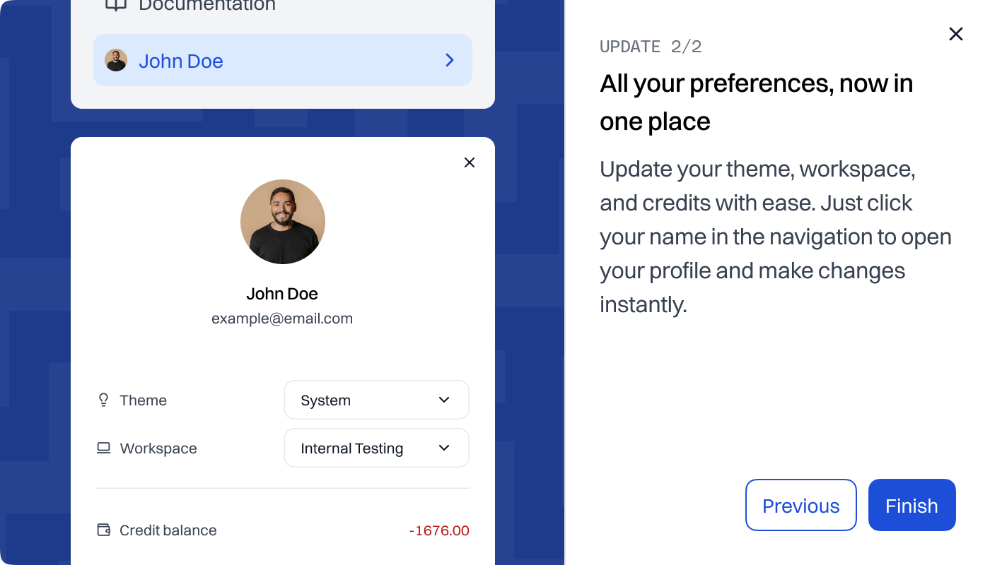
For our users, who spent most of their time cross-referencing tables and analyzing data, the cleaner layout made a real difference. It kept their workspace focused, reduced distractions, and made new features easier to discover.
The impact wasn't just external. This navbar redesign was the first thing we shared with the engineering team. It created energy and buy-in for the broader UI 2.0 effort. Sometimes, a small, tangible win is the best way to get momentum for a big change.
While I can't share much of the solution due to my NDA, we worked hard on a lot of big changes to how we structure and organize concepts on our platform. The navbar was just the beginning, and as time moved on, it was clear that our work brought the platform closer to what users expected and needed from us.
Impact & Outcomes
- Retention of key customers: We stabilized churn by addressing the biggest workflow pain points quickly. This gave our highest-value customers confidence to stay with us instead of leaving for competitors.
- Landing Cisco: The redesign played a pivotal role in securing Cisco as a client. A cleaner, more cohesive UI showed that we could meet enterprise expectations and compete seriously in the market.
- Team learning and motivation: Bringing new hires into the workshops helped them ramp up faster and see how different parts of the product connected. Documenting the work gave us a shared vision and bonded the team around building something better.
- Foundation for the future: This wasn't just a surface-level refresh. The redesign erased a year of UX debt and gave users a far more understandable foundation, one we could confidently scale and build on.
Reflection & Learnings
What I'd do differently
- Empathize more with the business. Once you get deep into a redesign, it's easy to stay at the low zoom level. Colors, type, components, screens. What I've learned since is to keep business goals front and center. Design isn't just about what feels best to me as a designer, it's about aligning with where the company needs to go.
- Align earlier on strategy. The paradox kept coming up: to land Cisco, the product needed to become more powerful; to keep current customers, it needed to feel simpler. More power usually means more complexity. I wish I had documented these debates and maintained a decision log early on. It would have helped the team align faster and reduced the feeling that we were constantly picking the wrong battle.
- Use data better. I became confident in running interviews and gathering rich qualitative insights, but I didn't have strong quantitative data to balance against. If I could redo it, I'd push harder on usage data so we had a more holistic view of what mattered most.
What I'm proud of
- Owning a product pillar. I took end-to-end ownership of post-deployment monitoring, from the first bet to a polished version with an execution plan.
- Empathy for engineering. I learned how to deliver designs engineers could actually use. Ones that explained themselves clearly and didn't just look good in Figma. That collaboration made me far better at communicating across design and engineering.
- High-stakes communication. I presented product and design updates directly to customers and investors. These conversations carry risk; one misstep can erode trust. I handled them well and built confidence in both our team and our product.
Personal Growth
Working at Hamming blurred the line between design and product management. I came in as a designer, but I left with a stronger sense of experimentation, momentum, and ownership. I learned how to balance "bets" versus "features," how to advocate for engineering time, and how to make decisions with business outcomes in mind, not just design craft.
The team itself was highly experimental. We loved trying new tools and new ways of working, and I had the unique experience of being on the buyer side for many of them. Sitting in on sales calls and deciding whether to purchase tools like Dovetail or BuildBetter gave me an unexpected crash course in B2B sales. It was eye-opening to see how sales teams frame value, and it sparked a personal interest in working more closely with sales and customer support as a future "voice of the customer."
This experience showed me how much I value ownership and impact. If your team sounds like it could value that, I'm open to roles starting January 2026.