
A new design for a new identity
The UW Marketing Association (UWMA) is an up and coming club at the University of Waterloo. While was originally started in the spring of 2021, it had to be shut down due to a new wave of COVID restrictions. The club restarted in the fall of 2022 with a new vigour to spread the love of marketing among UW students.
A new vision
To start afresh, we knew that we needed a redesign to truly reflect our brand. UWMA is fun, creative and collaborative. Our old beige and black design did not communicate that. Being the only marketing focused club on campus, we are the hub for all students with an interest in marketing, and trust us, there’s a lot of students who fit that description.
“We’re like a chill tech company where the employees wear t-shirts and pants.”
Dhruvi Shah (Co-founder)
Distilling a brand
Distilling the brand identity of such a diverse club was not an easy task, however, an interview with the president revealed a few key priorities.
A modern look
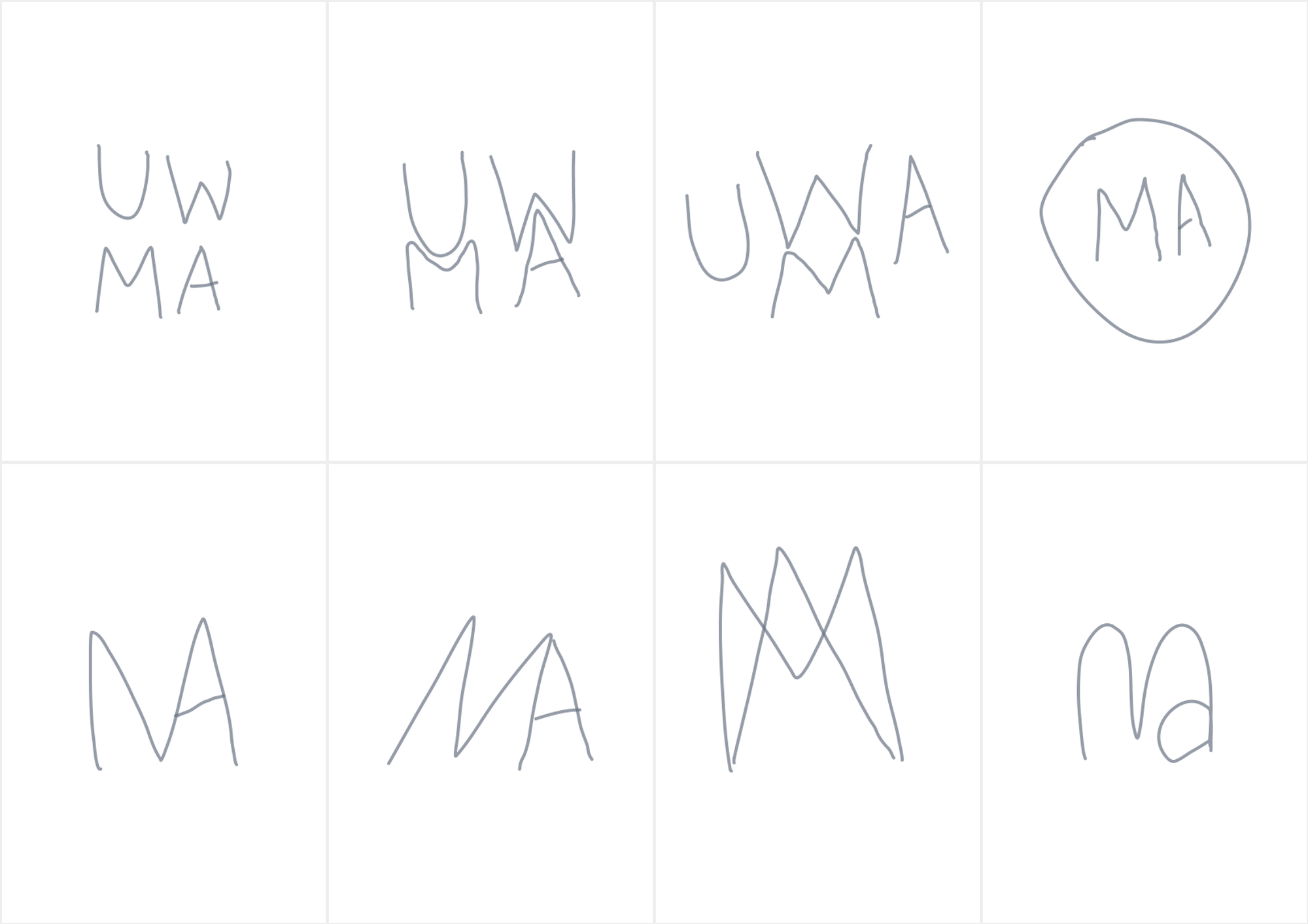
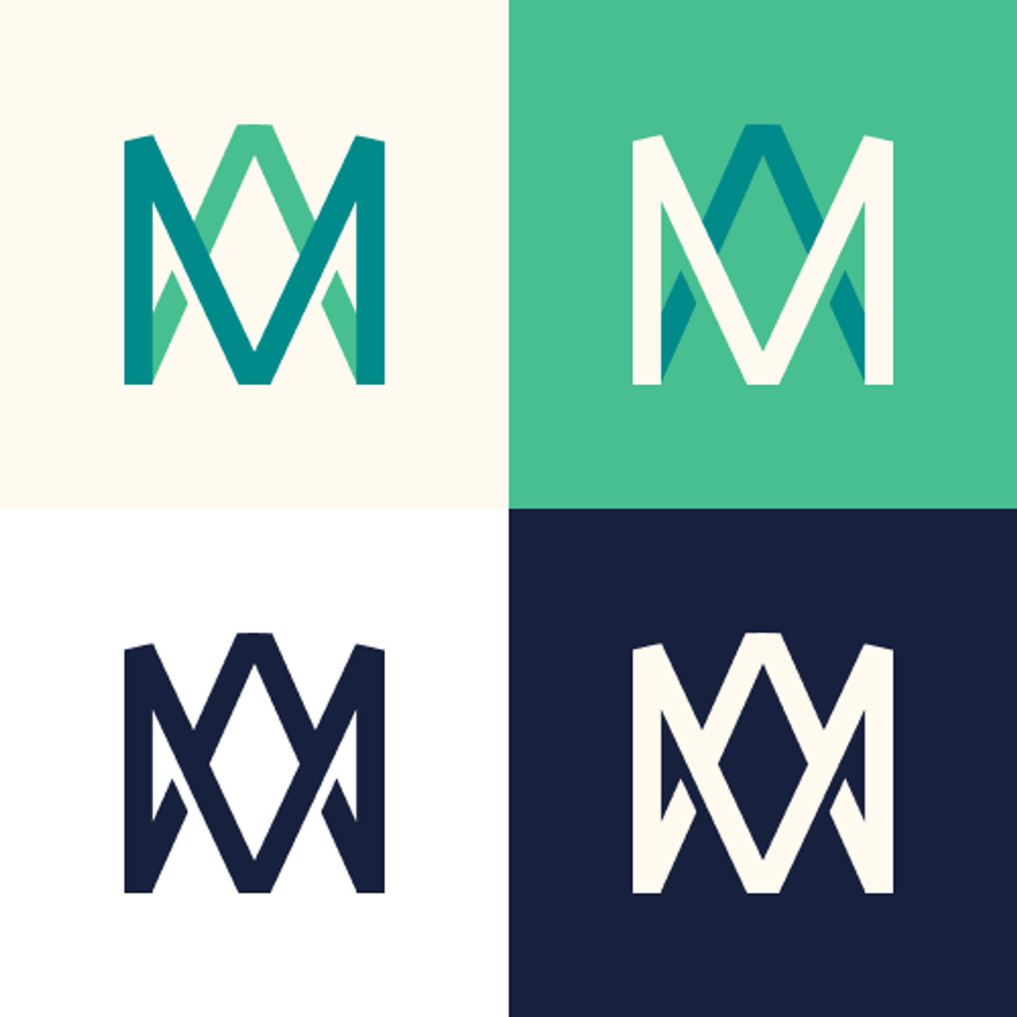
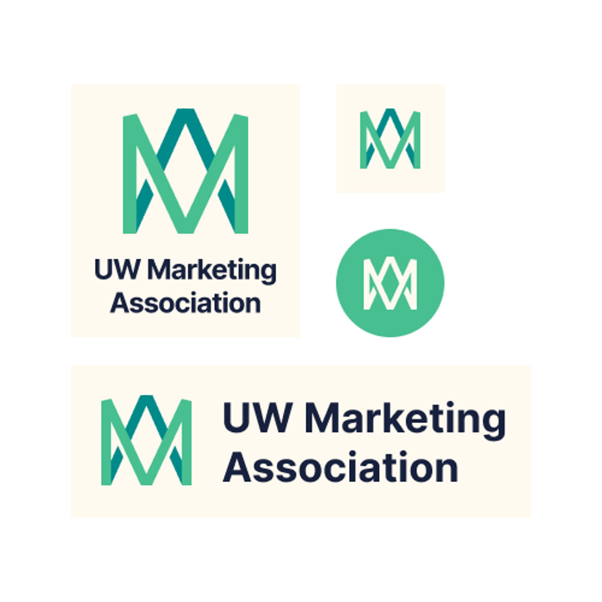
To achieve a modern look and feel, I chose to go with a geometric letter mark. While the original idea was to include all the letters of UWMA, I soon pivoted to just MA (Marketing Association) to avoid redundancies. Being in located at the University of Waterloo, the UW can be implied.
I tested several variations of putting together the 2 letters and landed on something that felt just right. See some of our sketches below (Recreated digitally).
Fun and passionate
The best way, in my opinion, to accomplish this was through the strategic use of colour. While red is the first colour that comes to mind when thinking about passion, I decided against it because of it’s alarming nature. Green, I realized, can convey passion while being welcoming as well. Mint (#3FCB99) served the purpose perfectly.
Adding accents
A complementary colour scheme would bring energy to our designs, however I also needed to ensure that our colours were subdued enough to work in real world contexts.
Adding Depth
Gradients, when used well can add a lot of visual interest to a design, however, they go wrong just as
easily. To prevent the misuse of gradients, I put together a few approved gradients for our future
designs. The idea with these gradients was to keep them simple and subtle.
Neutrals to complete the look
I decided against using solid white and solid black for accessibility reasons. Putting those two colours on top of each other can create uncomfortable levels of contrast. Hence we chose an off white and navy blue to be our neutral colours.

Sleek and versatile typography
Admittedly, typography is not my strong suit and I had support from my supervisor while choosing our fonts. We restricted ourselves to google fonts for easy use by all team members and integration with the website. We settled on simple, yet versatile set of fonts.
Same brand, different forms
With any logo, it’s important to design for various applications. While our primary logo form was complete, we still had to account for variations in colour and layout.
Putting it all together
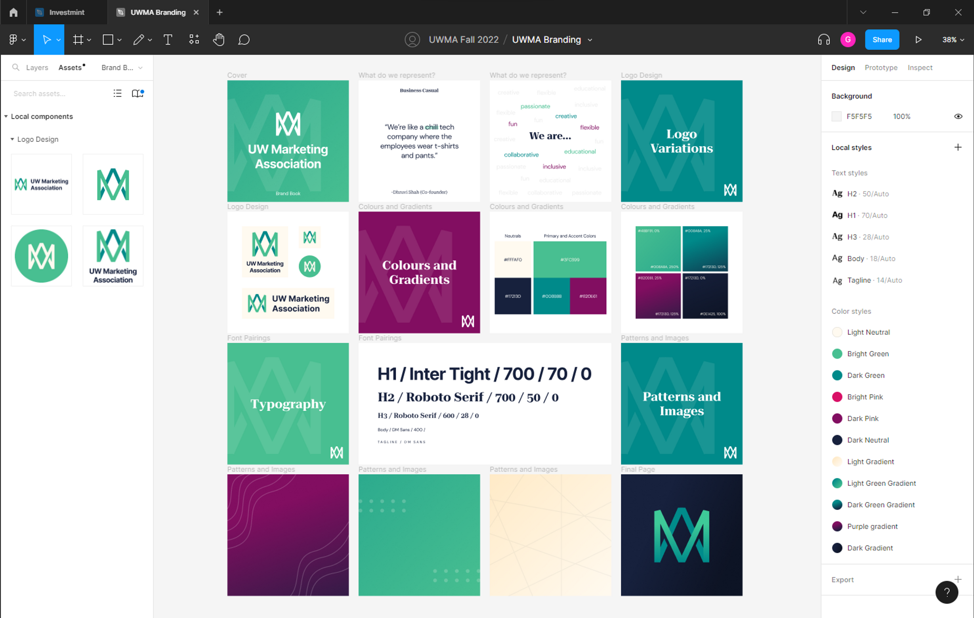
I created brand book to showcase our design guidelines and help in the onboarding of any new designers. I also added some patterns and backgrounds at the end to serve as inspiration.
Considering future members
While compiling the file, I made sure to create components and record text and colour styles in the document to help future design team members. While the rebranding was complete, it was also important to ensure that it was as easy as possible to follow to follow the brand guidelines.
Applications
We here at UWMA embrace creativity. Our brand guidelines left room for designers to adapt and embrace their own style as well. The guide was mainly used for our social media posts so far, however with a case competition coming up in the Winter 2023, the applications will grow multifold.
Instagram Posts

Impact
After the rebrand, we noticed a lot more engagement with posts. Our unique identity let us stand out from other club posts and attract more people to our Instagram and Linktree.
423%
increase in engagement
316%
increase in post interactions
700%
increase in profile visits
Key Takeaways
🤩 Full creative control is really rewarding
Having done a lot of design work in the past, I was confident about my abilities going into this project, however throughout the course of the term I learnt more that I thought possible. I had the chance to work with so many skilled people and learn a lot. I performed a lot of research to make sure I did this project right and I feel like it paid off.
For example, while choosing accent colours led to me down a rabbit hole to learn about accessibility and how black and white may actually cause some accessibility issues.
🖼️ It’s a lot more than a logo
While I saw examples of brand books in the past, creating one was a very different experience. The sheer number of considerations was beyond my expectations. Distilling a brand identity goes way beyond a logo. It was really fun thinking strategically about a colour scheme, typography, etc.
👁️ Everyone has a different interpretation
While the brand book can provide a general guideline, every designer is going to have a different interpretation of how to use the guides. For example, the design team began using the subheading font more in the Instagram posts. It is important to leave room for creativity as long as their is a cohesive identity.